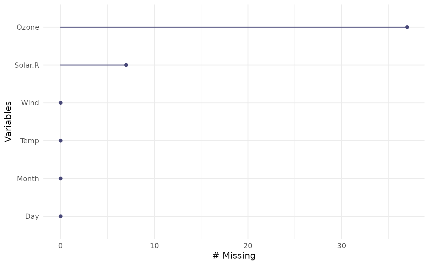
This is a visual analogue to miss_var_summary. It draws a ggplot of the
number of missings in each variable, ordered to show which variables have
the most missing data. A default minimal theme is used, which can be
customised as normal for ggplot.
Usage
gg_miss_var(x, facet, show_pct = FALSE)
Arguments
- x
a dataframe
- facet
(optional) bare variable name, if you want to create a faceted plot.
- show_pct
logical shows the number of missings (default), but if set to
TRUE, it will display the proportion of missings.
Value
a ggplot object depicting the number of missings in a given column
Examples
gg_miss_var(airquality)

if (FALSE) { # \dontrun{
library(ggplot2)
gg_miss_var(airquality) + labs(y = "Look at all the missing ones")
gg_miss_var(airquality, Month)
gg_miss_var(airquality, Month, show_pct = TRUE)
gg_miss_var(airquality, Month, show_pct = TRUE) + ylim(0, 100)
} # }
if (FALSE) { # \dontrun{
library(ggplot2)
gg_miss_var(airquality) + labs(y = "Look at all the missing ones")
gg_miss_var(airquality, Month)
gg_miss_var(airquality, Month, show_pct = TRUE)
gg_miss_var(airquality, Month, show_pct = TRUE) + ylim(0, 100)
} # }